
In 2017 I got to work in part of a team that developed the new brand Identity for Formula 1. This was a massive effort by a number of people, I was lucky enough to be one of them. This was a unique undertaking for Wieden + Kennedy who traditional are an advertising agency, but the disruptive approach they have to their way of working impressed the Formula 1 top execs, and so the journey to a new identity by and advertising agency began. As with any Agency job, I do not and cannot claim full ownership of this work, it is owned by Wieden + Kennedy London and Formula 1®
FORMULA 1 - BRAND IDENTITY
Role: Design & Brand Architecture
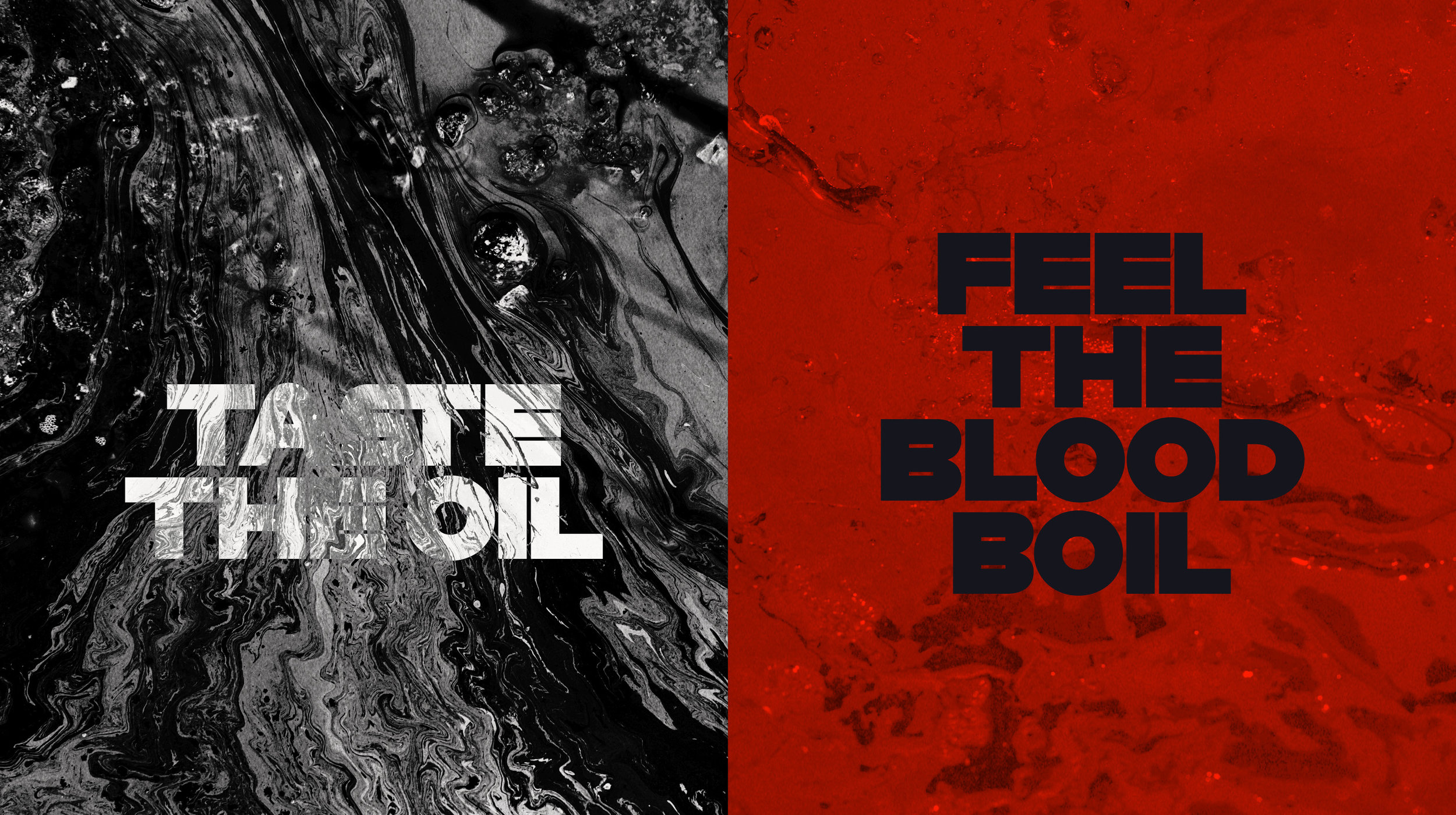
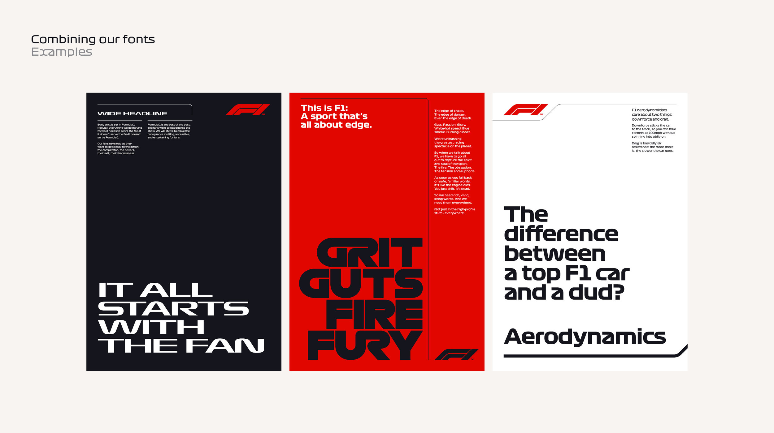
THIS IS F1®: A SPORT THAT’S ALL ABOUT EDGE.
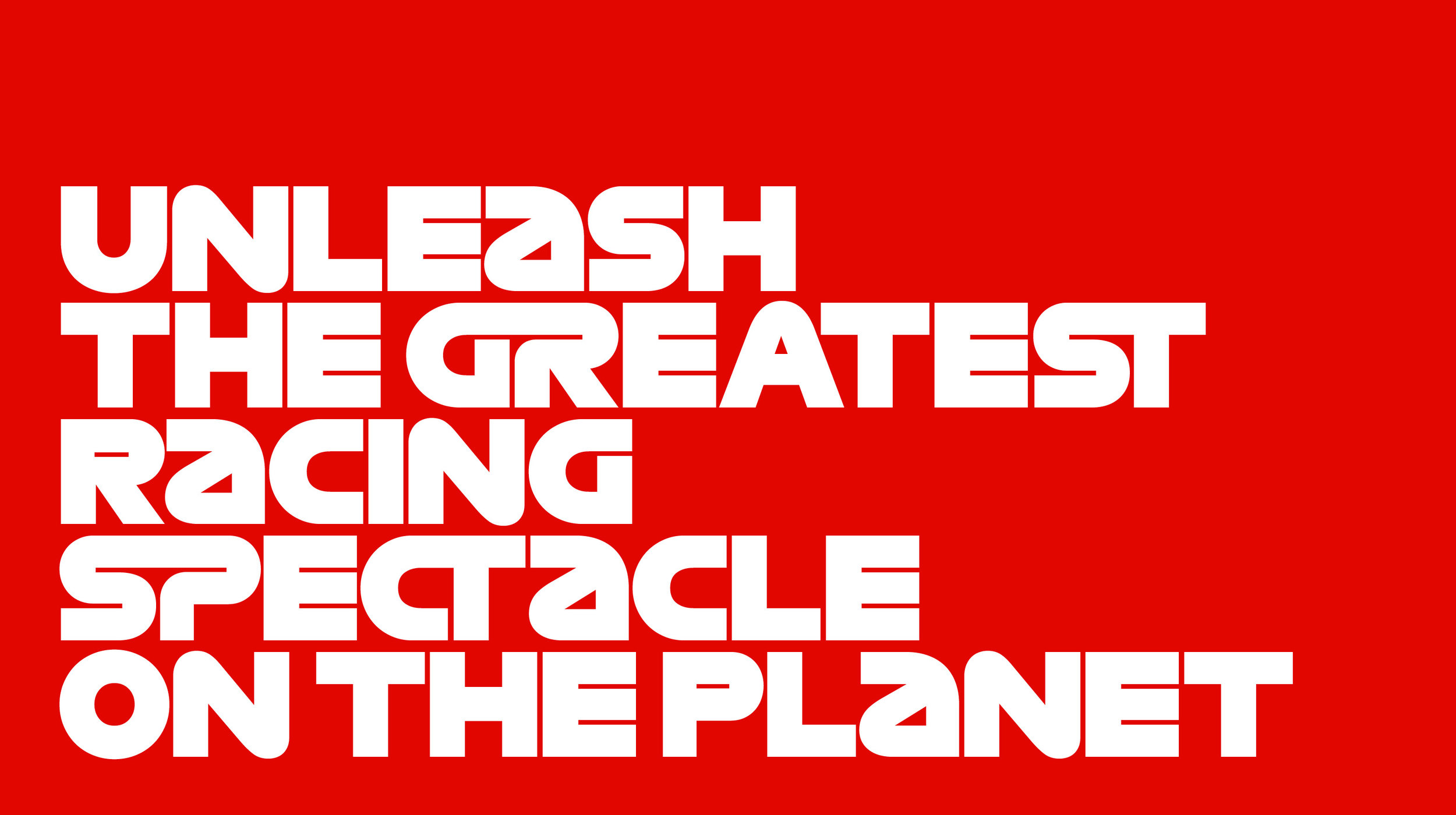
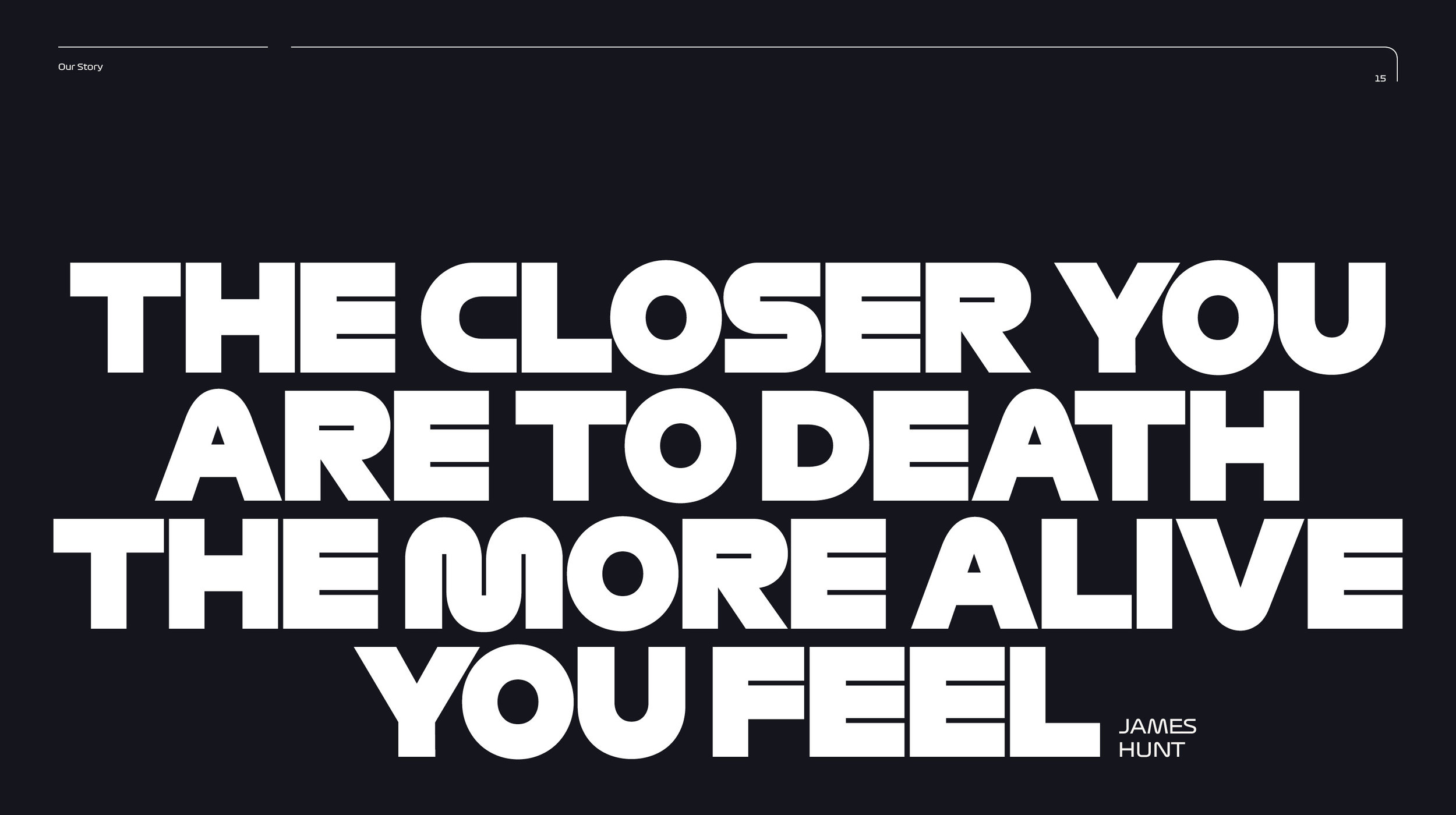
The edge of chaos. The edge of danger. Even the edge of death.Guts. Passion. Glory. White-hot speed. Blue smoke. Burning rubber. We’re unleashing the greatest racing spectacle on the planet. So when we talk about F1, we have to go all out to capture the spirit and soul of the sport. The fire. The obsession. The tension and euphoria. As soon as you fall back on safe, familiar words, it’s like the engine dies. You just drift. It’s dead. So we need rich, vivid, living words. And we need them everywhere. Not just in the high-profile stuff – everywhere.Of course that’s not easy. Nor is taking a turn at 100mph. F1 is not about easy.But the principles and tools in this section will help. And it all starts with who we are as a brand: our Personality.
THE STORY
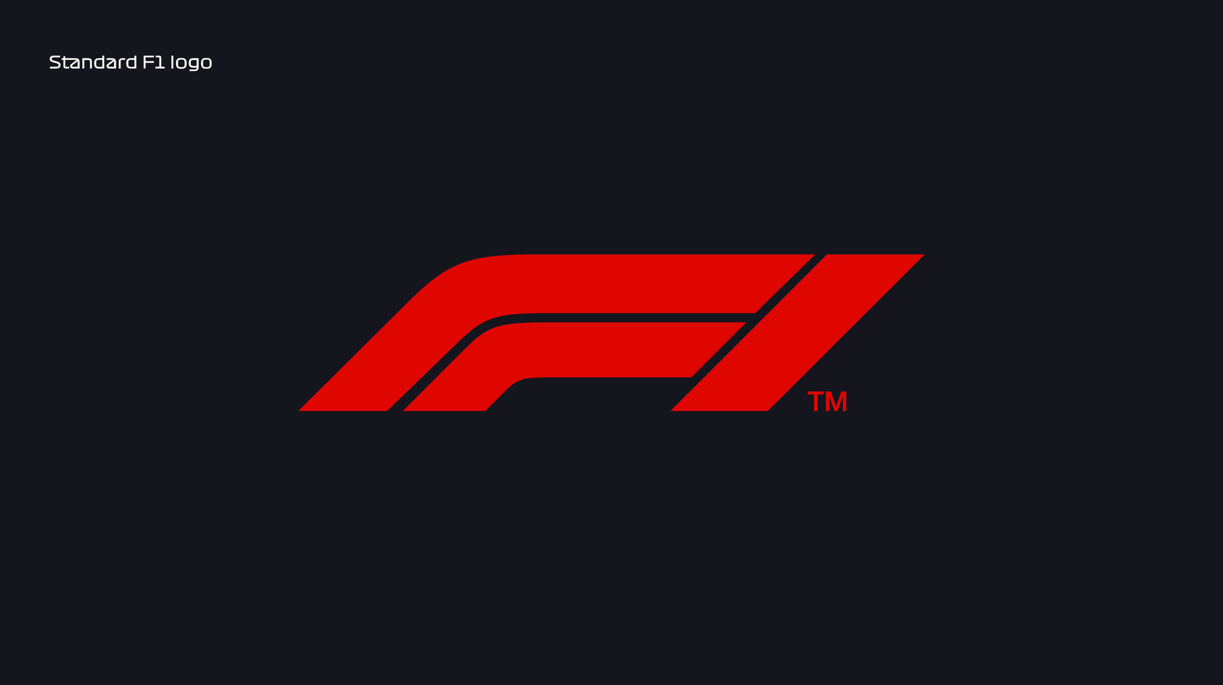
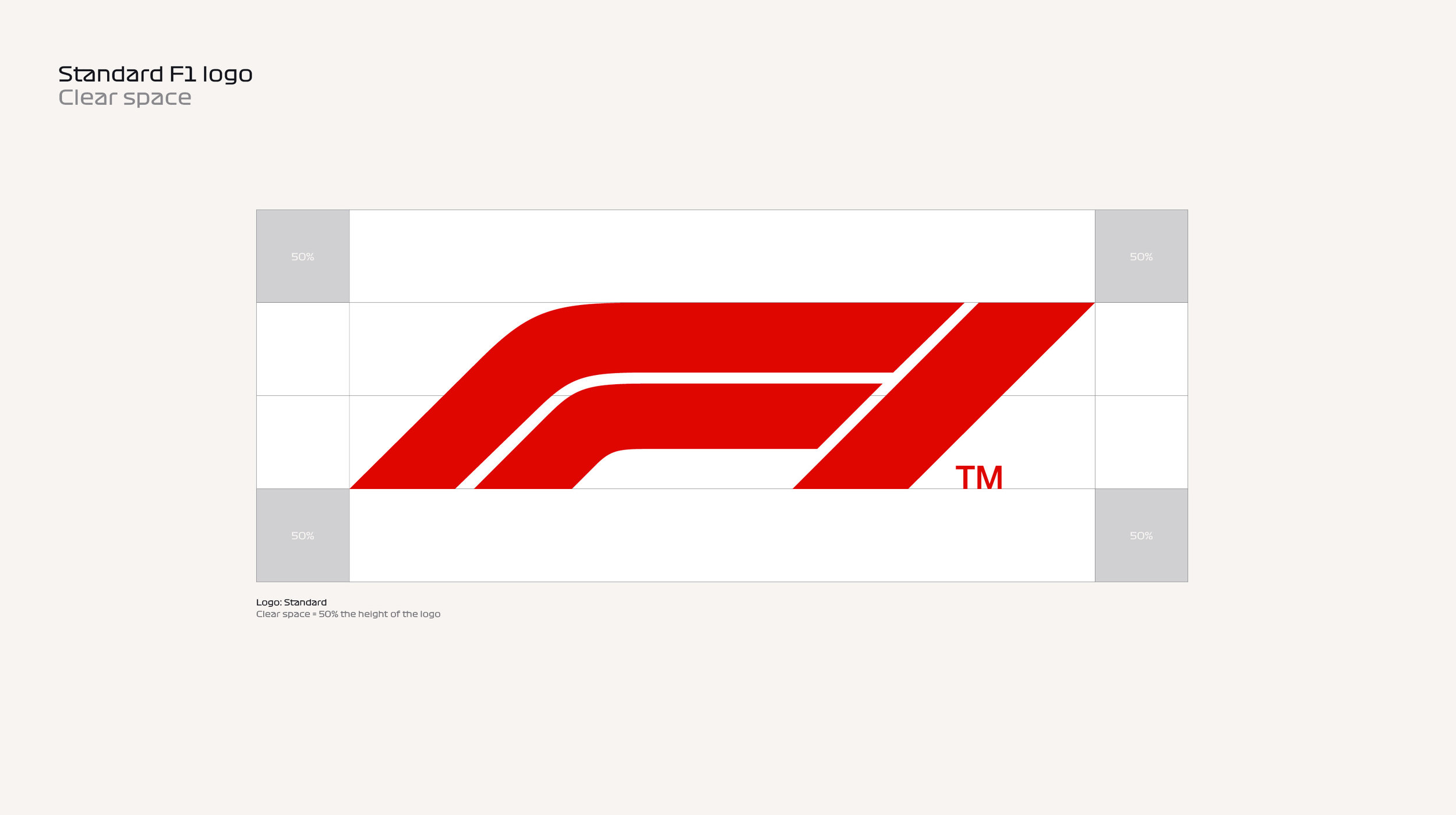
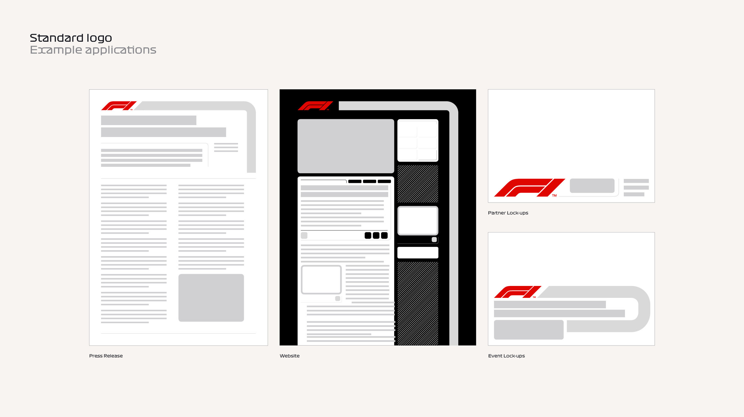
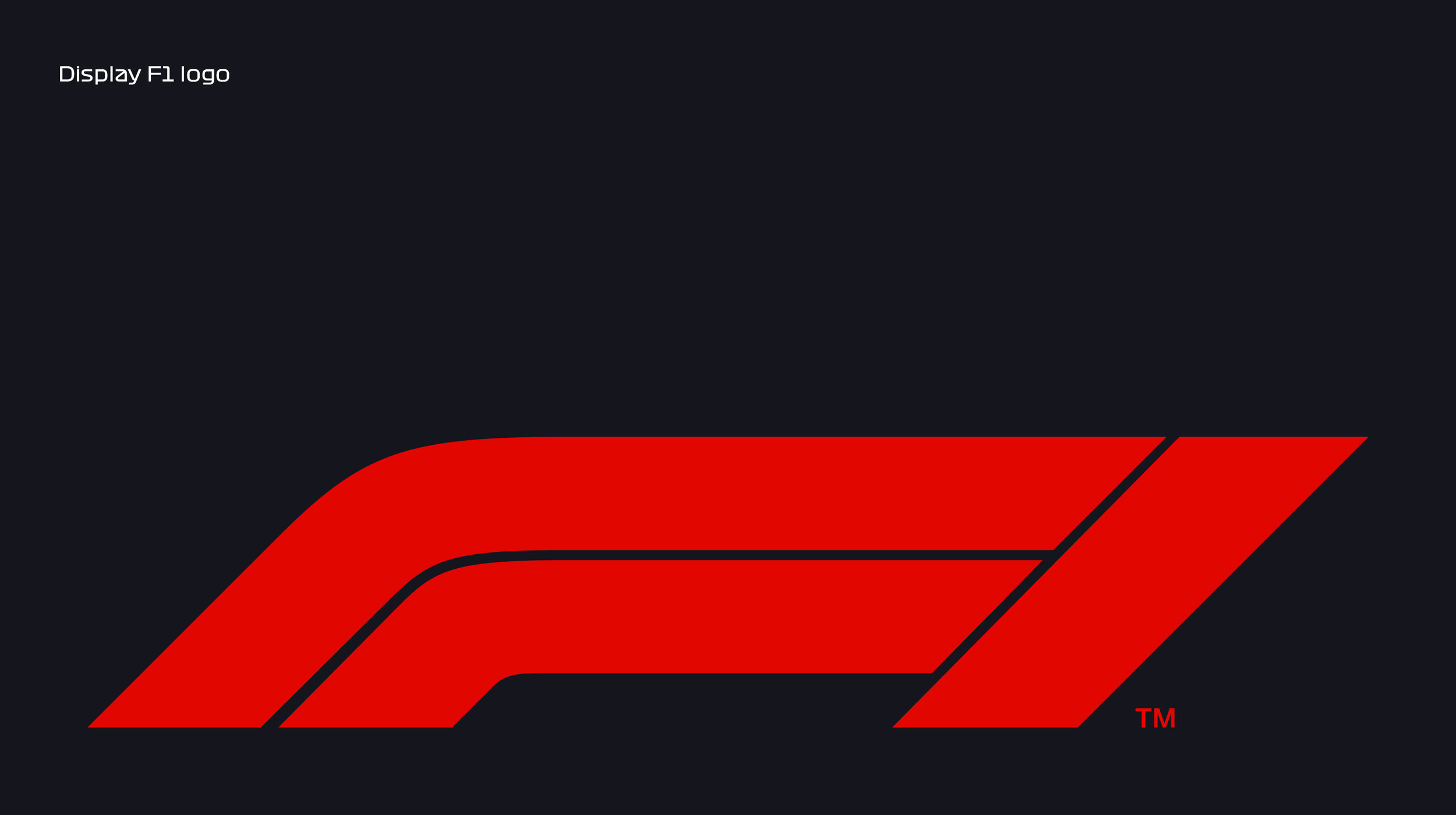
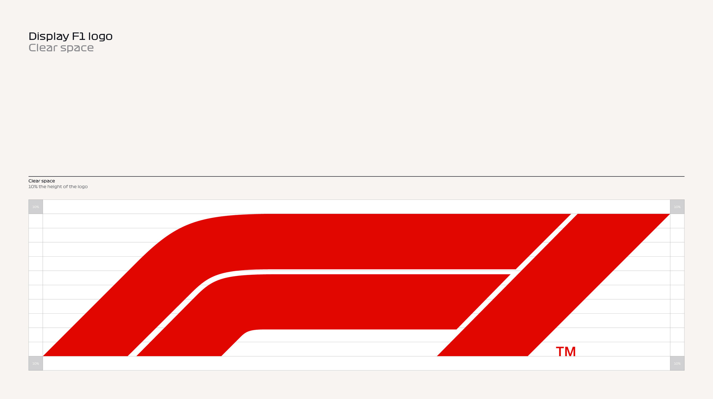
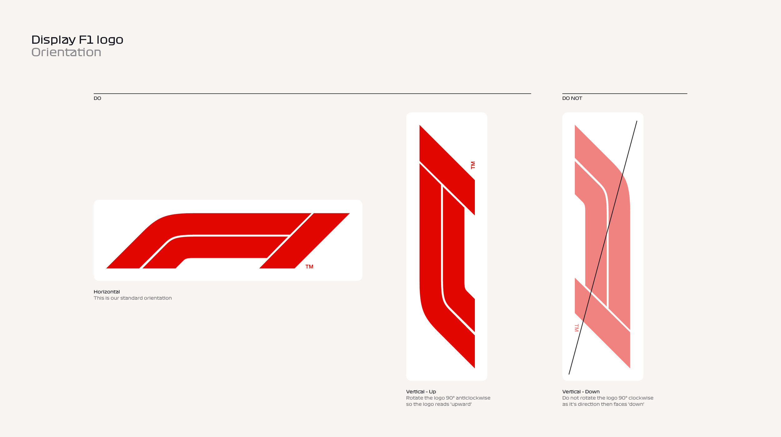
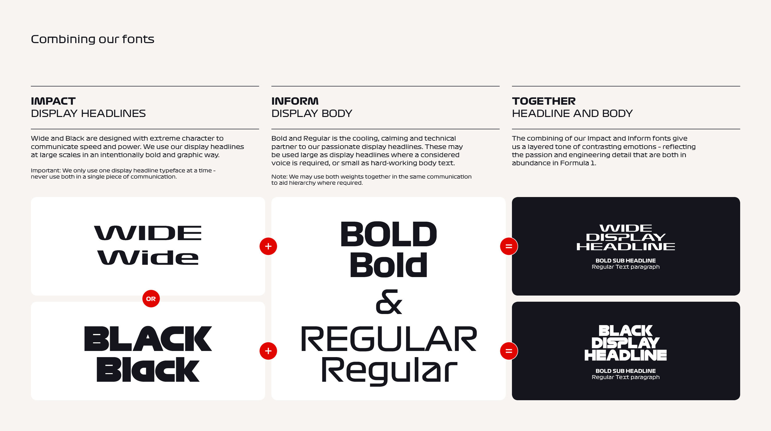
Because of the multitude applications this logo will needs to work in we decided to create 3 versions of it. The Standard is our workhorse logo designed to work across most applications. The Display version is our 'extreme' logo.
The extended look and narrower negative space enhance the sense of speed. This one's designed to be the hero: the focal point wherever it appears.
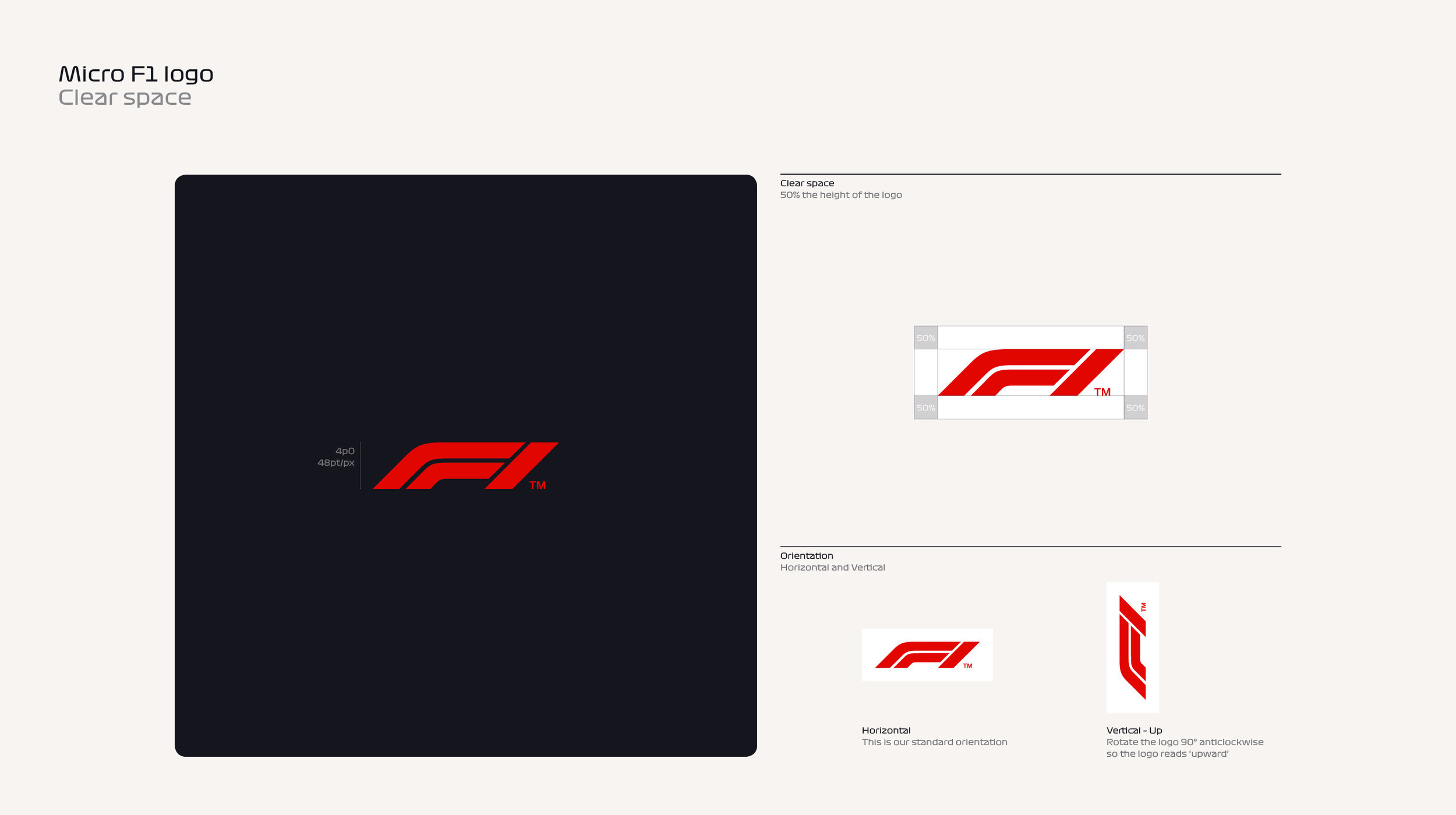
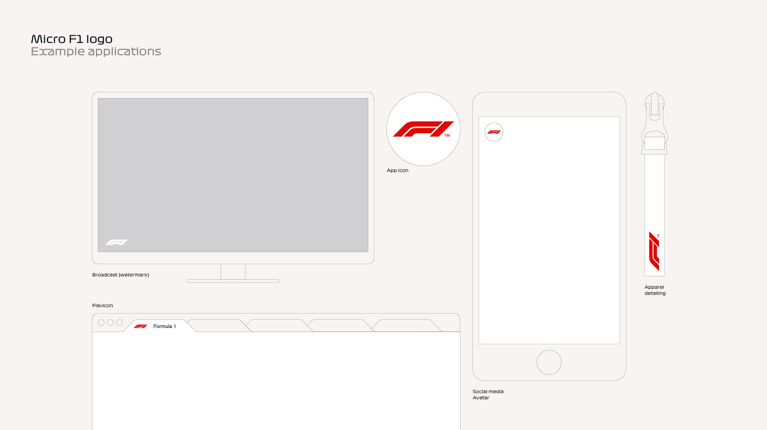
Lastly we designed the Micro version with more negative space, to be legible at small sizes.
LOGO
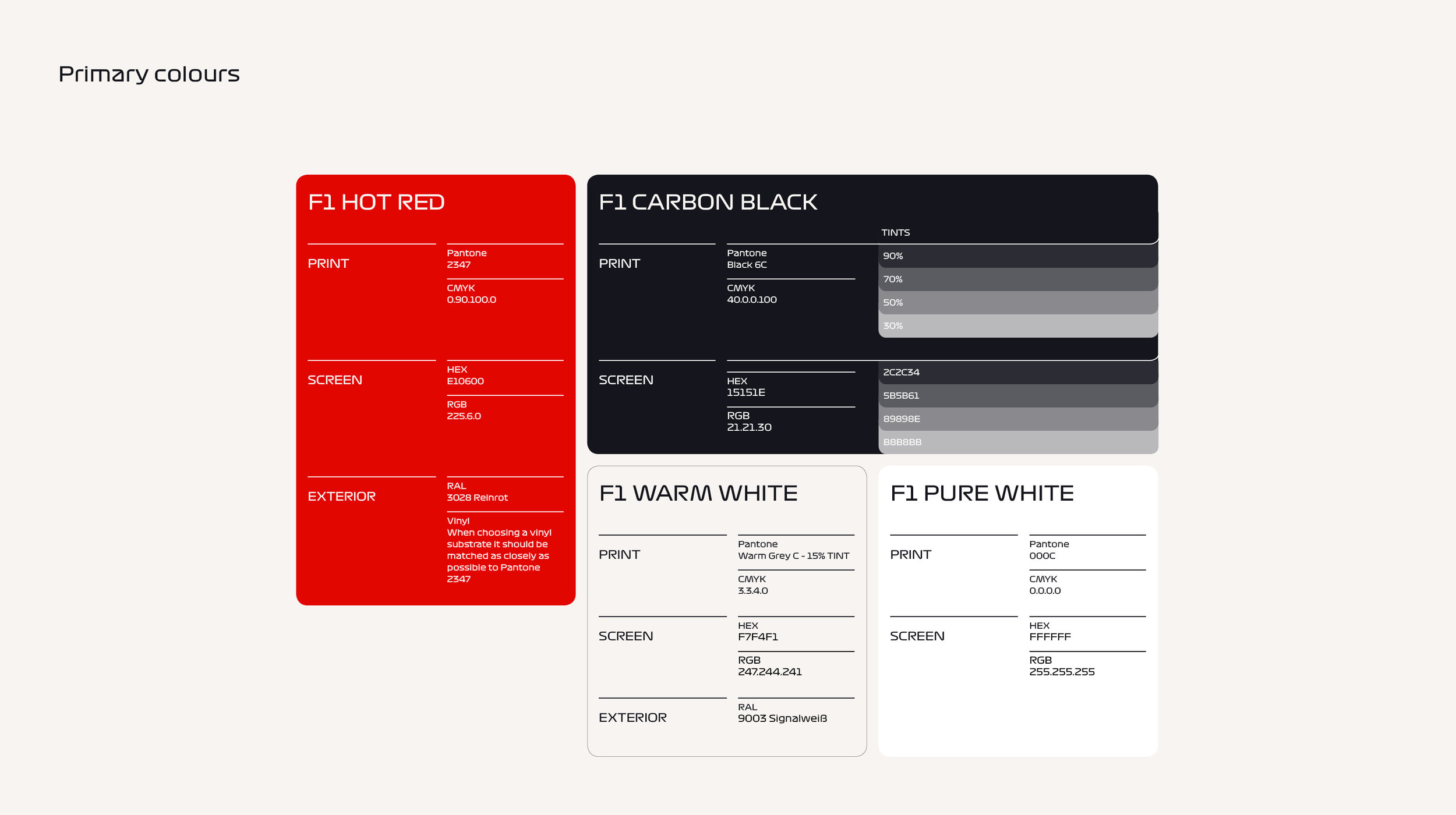
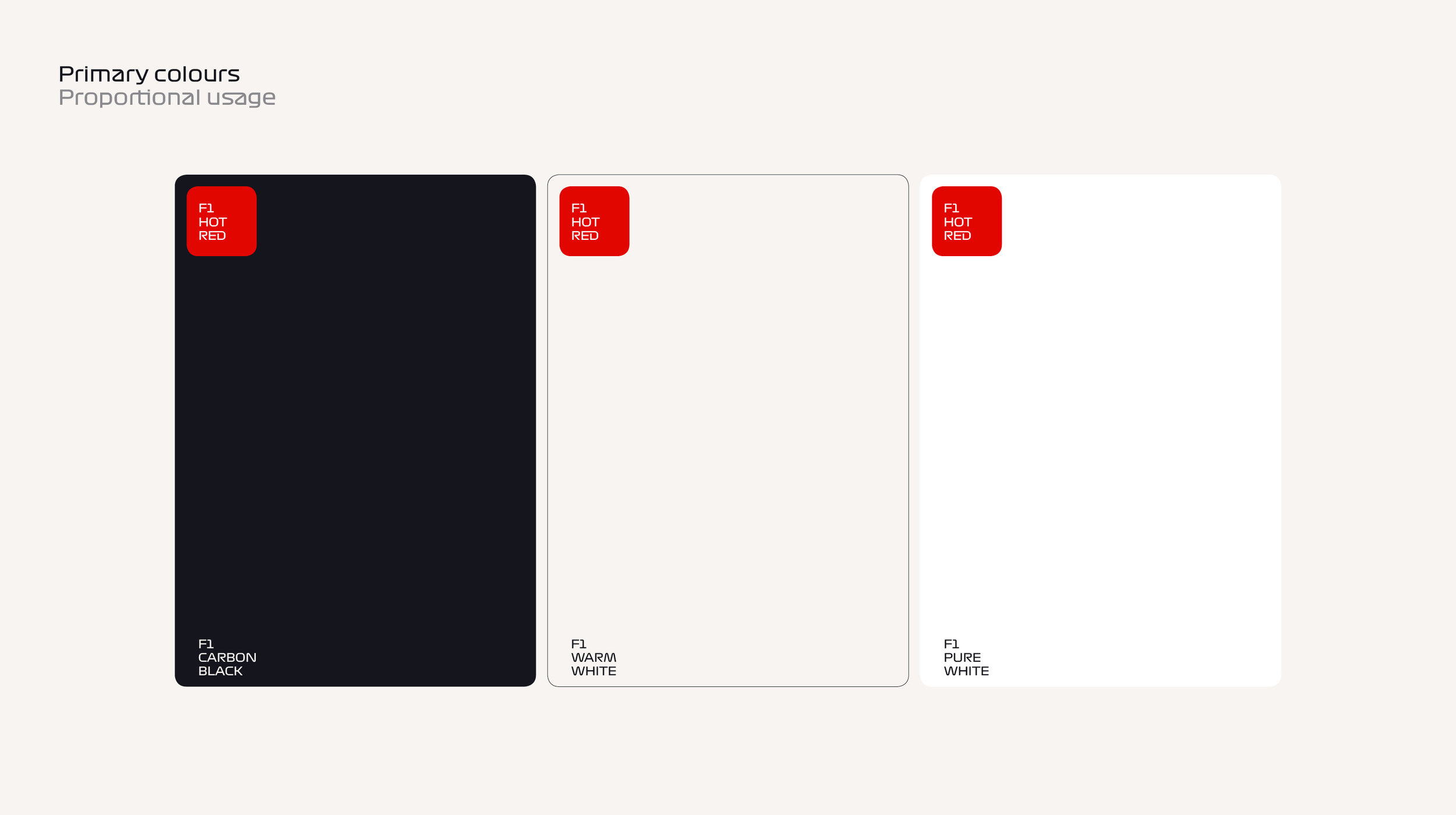
We have a very limited colour palette. Deliberately. It forces us to be bold and dramatic with the colour – and make the most of our Hot Red.
F1 Hot Red | Represents the heat, power and passion of Formula 1.
F1 Carbon Black | A steely blue tint. A cooling counterpoint to the heat of our red. To aid hierarchy, we may use our black in tints of: 90%, 70%, 50%, 30%.
F1 Warm White | Our neutral colour that allows our red and black to pop.
F1 Pure White | Used as a highlight where required.
COLOURS
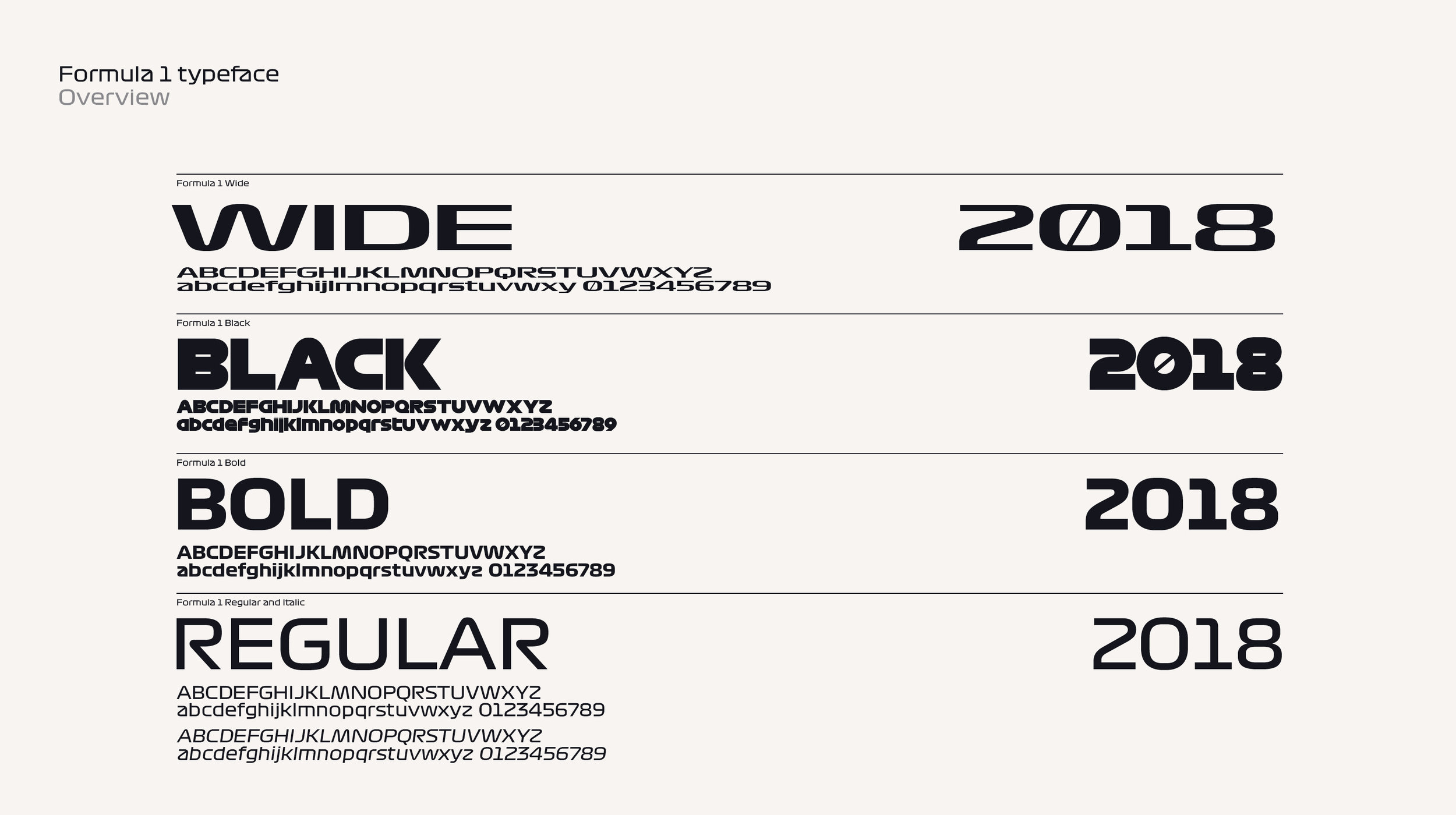
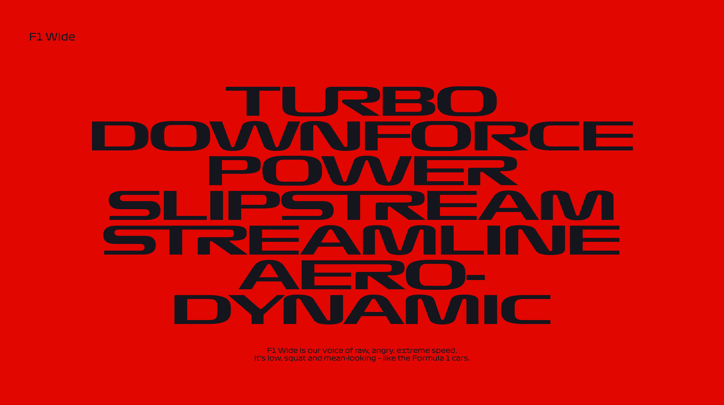
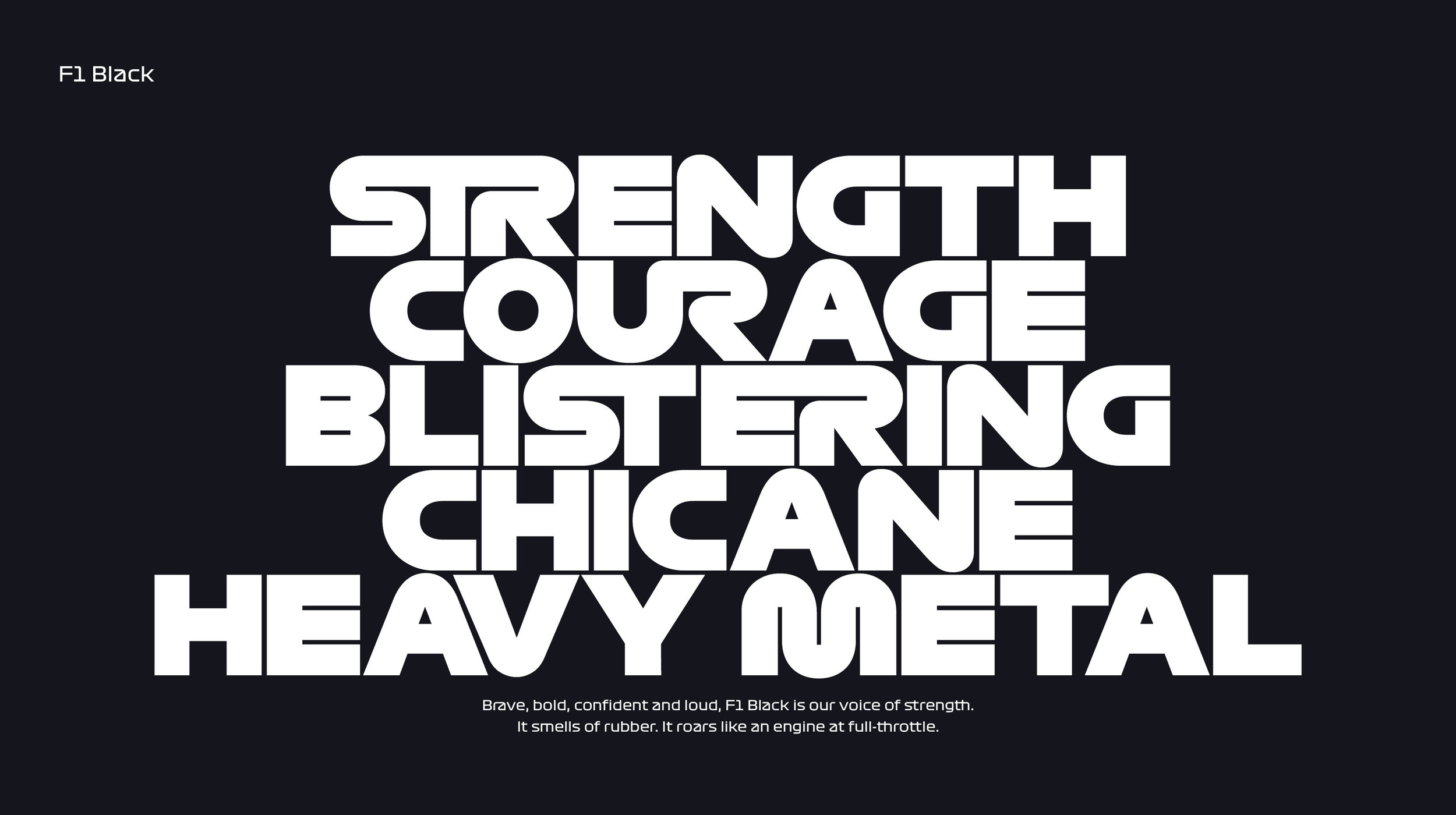
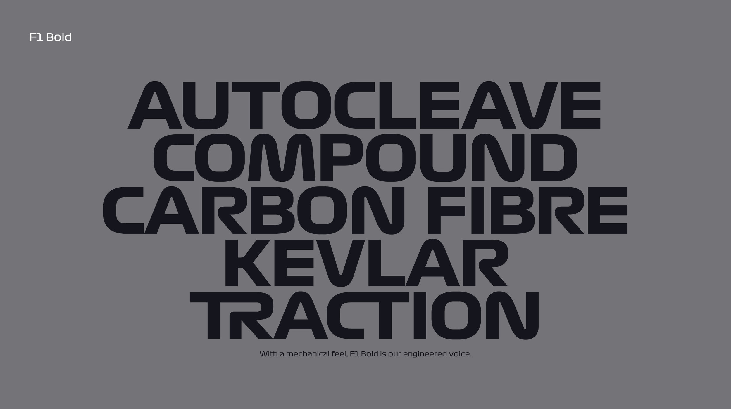
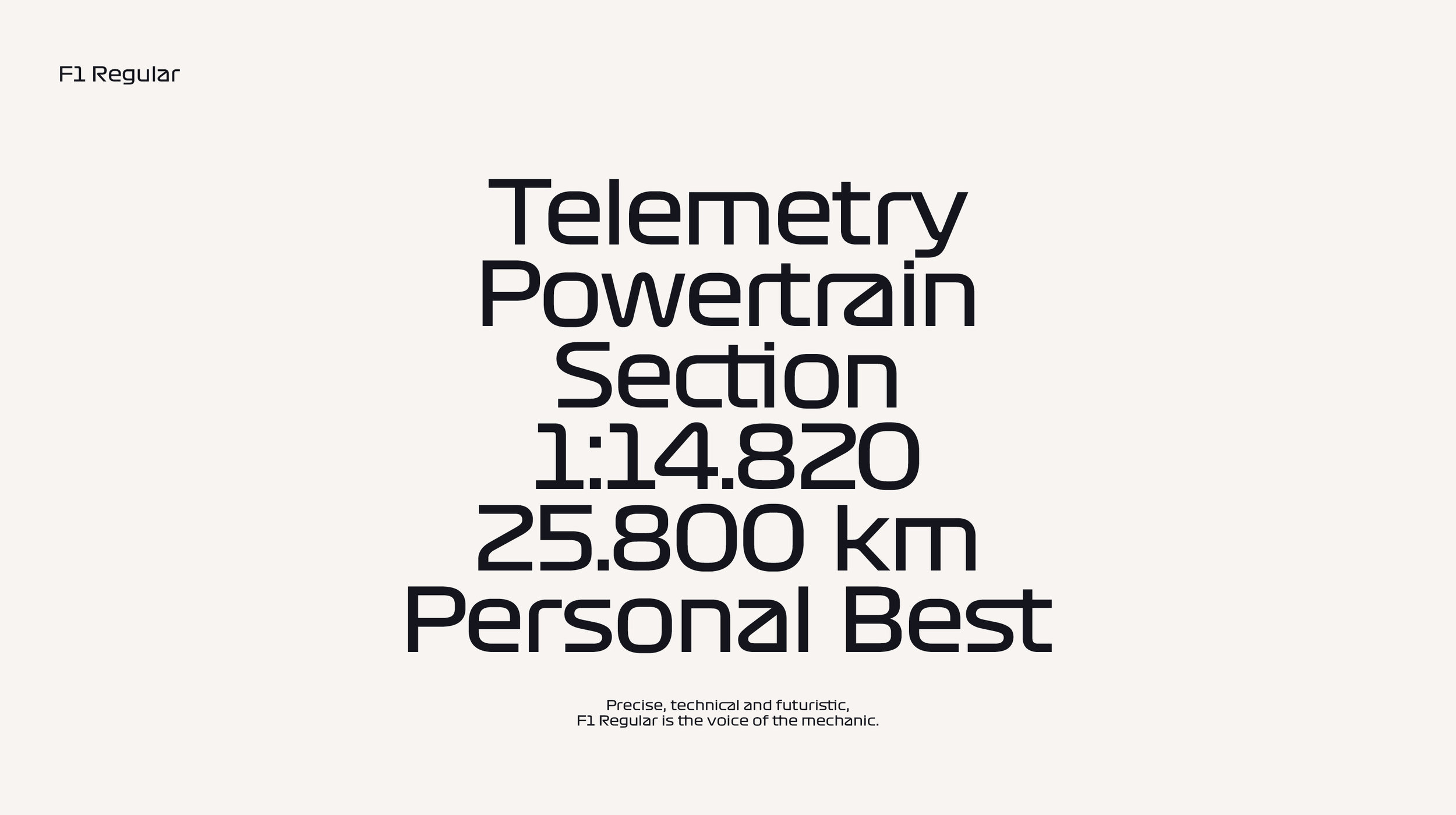
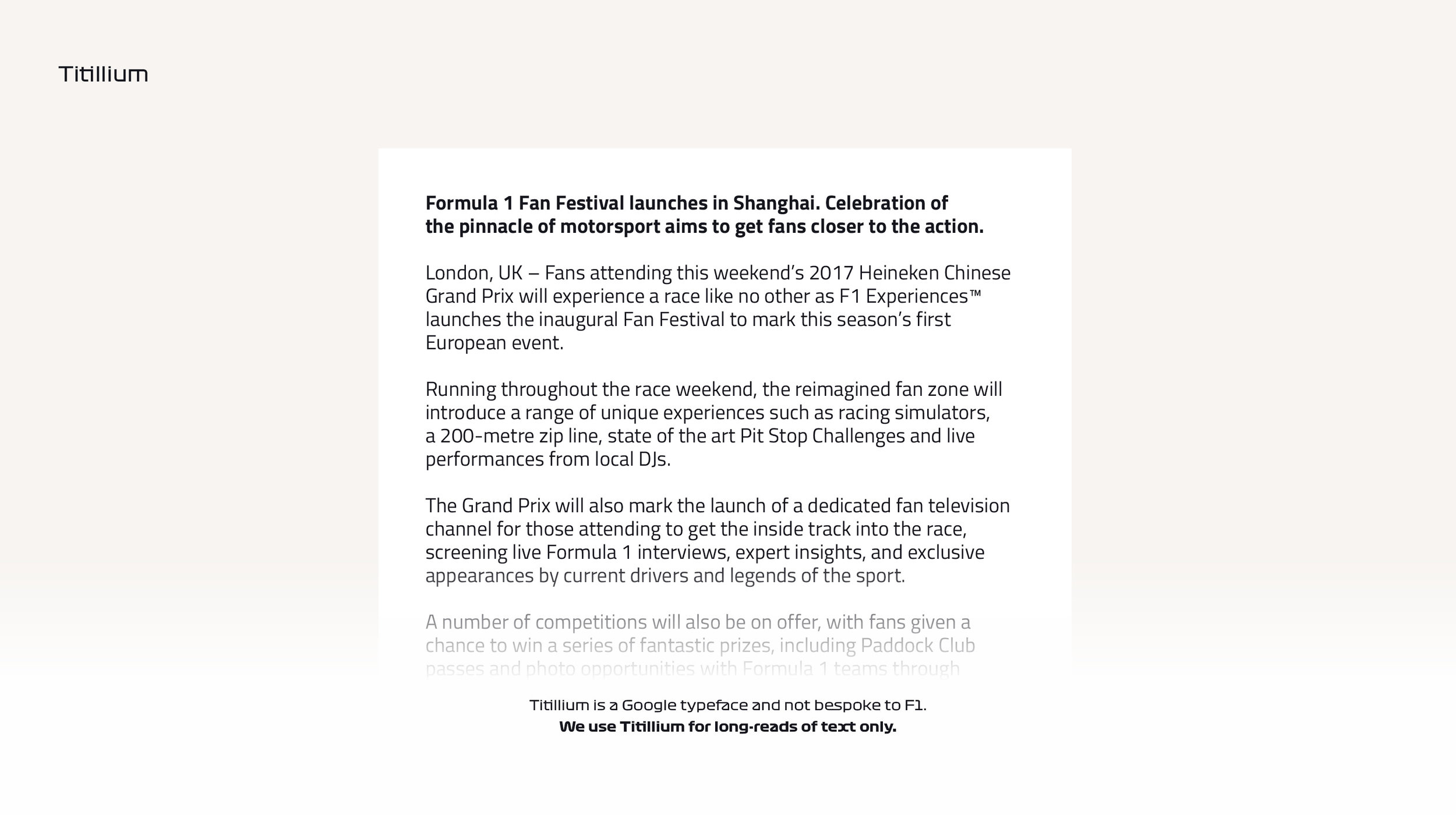
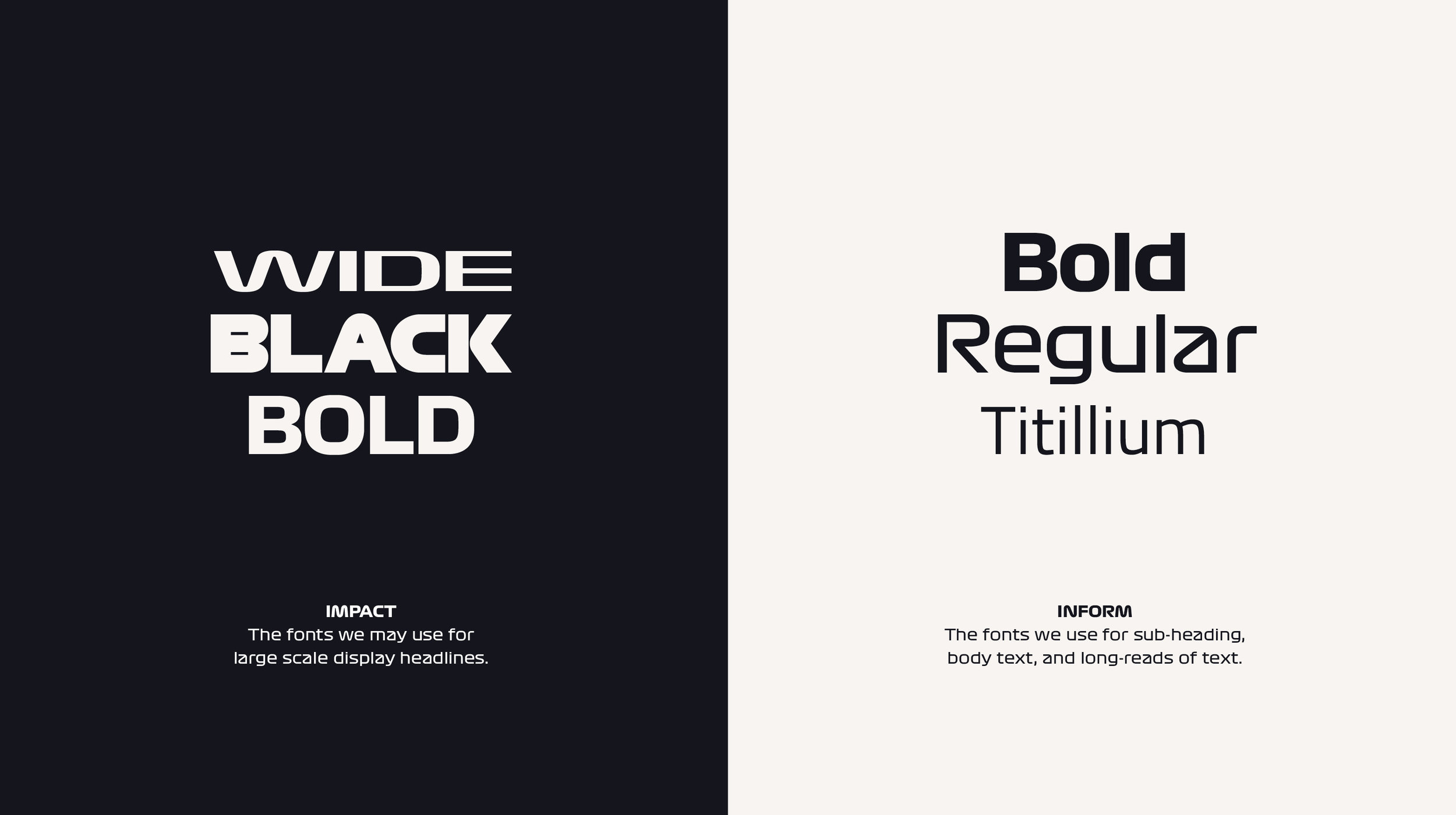
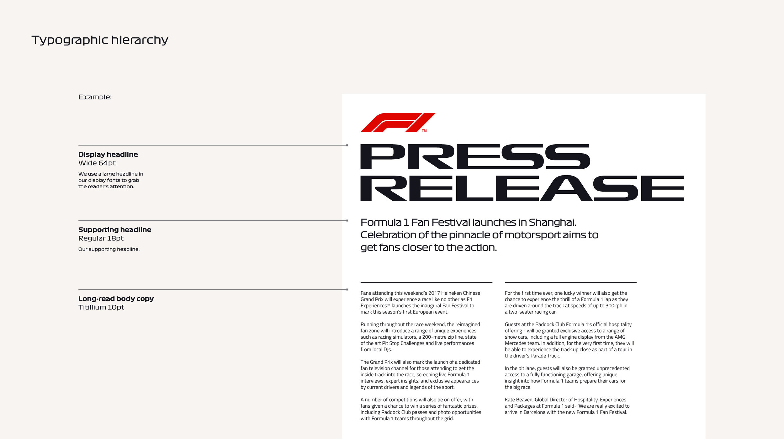
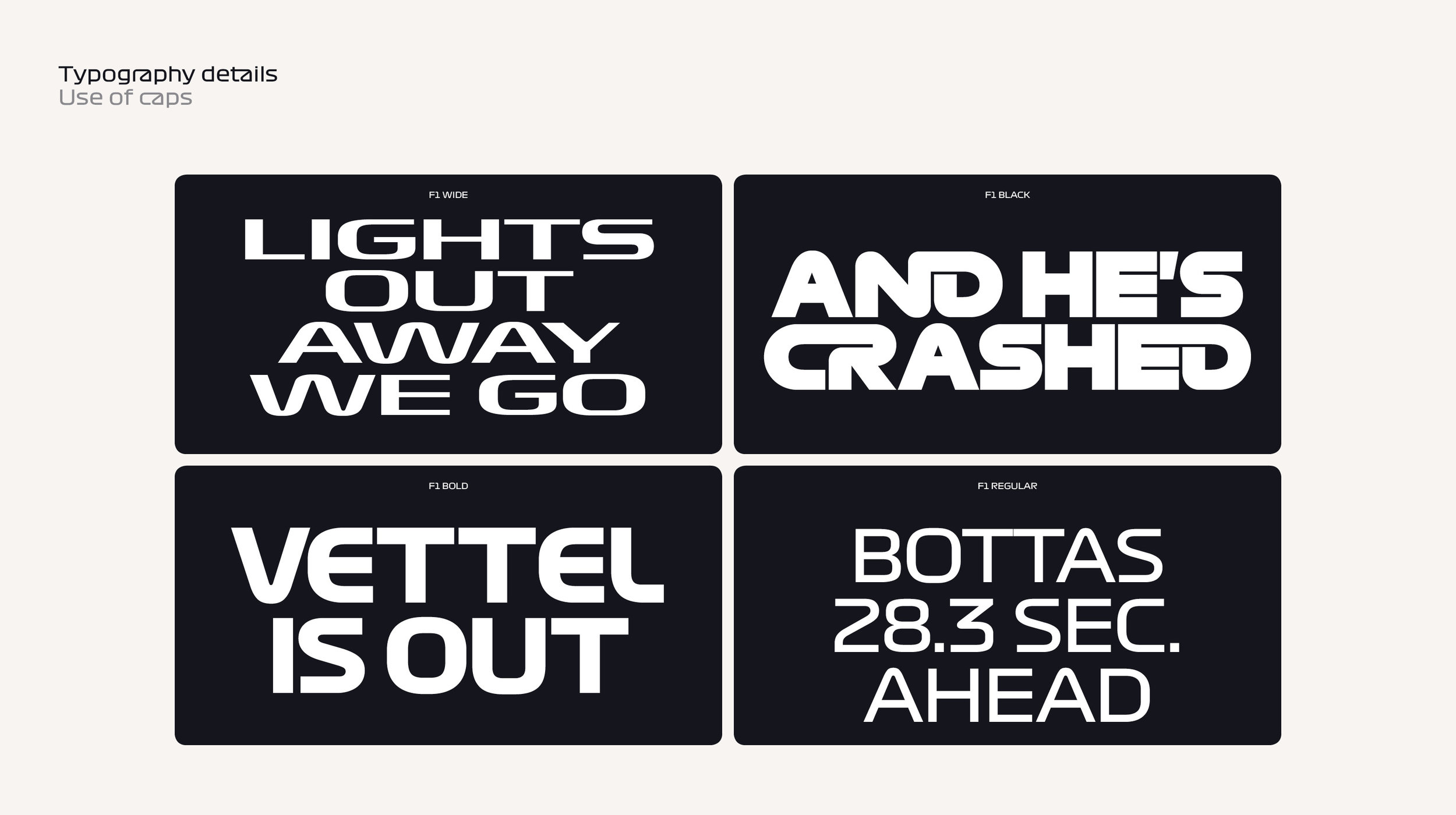
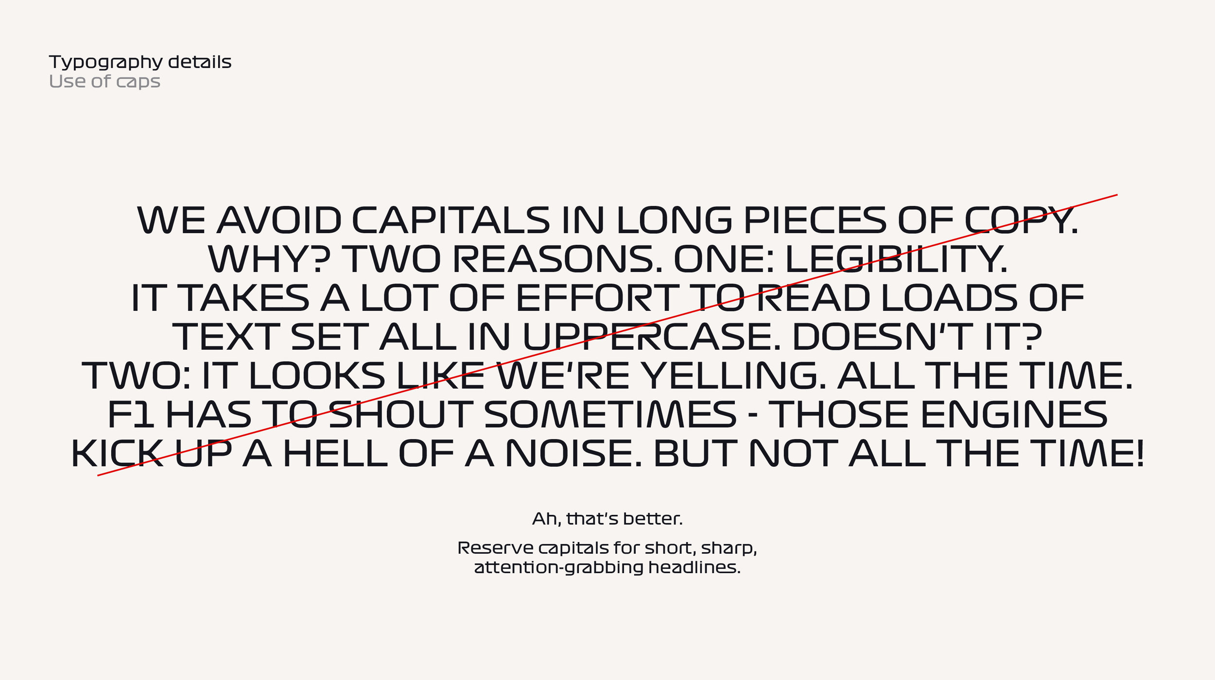
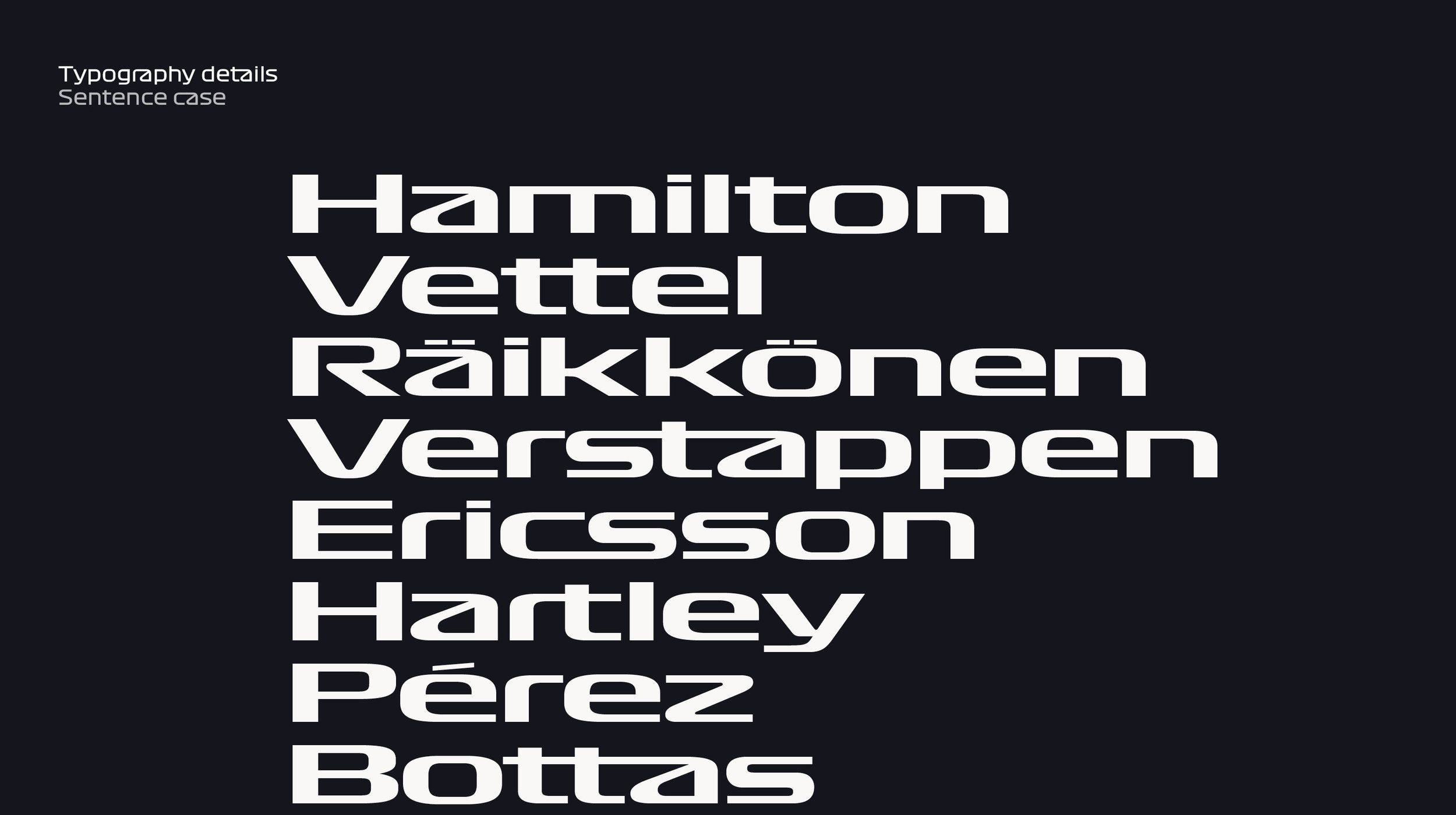
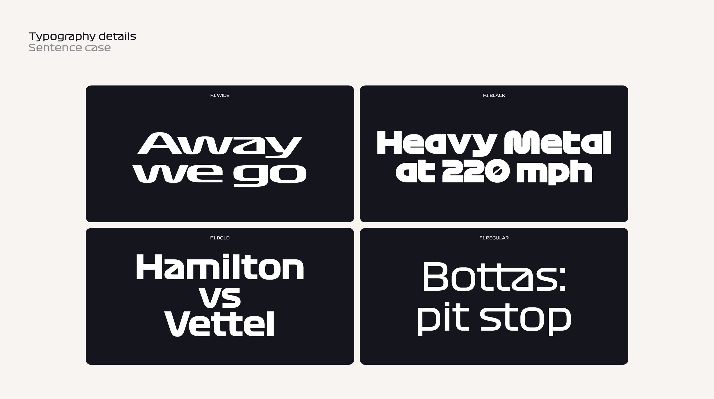
Our typeface is just that: ours. Exclusively created and drawn for Formula 1. It's every bit as distinctive and valuable as the logo. Use it consistently and it'll be just as powerful.
TYPOGRAPHY

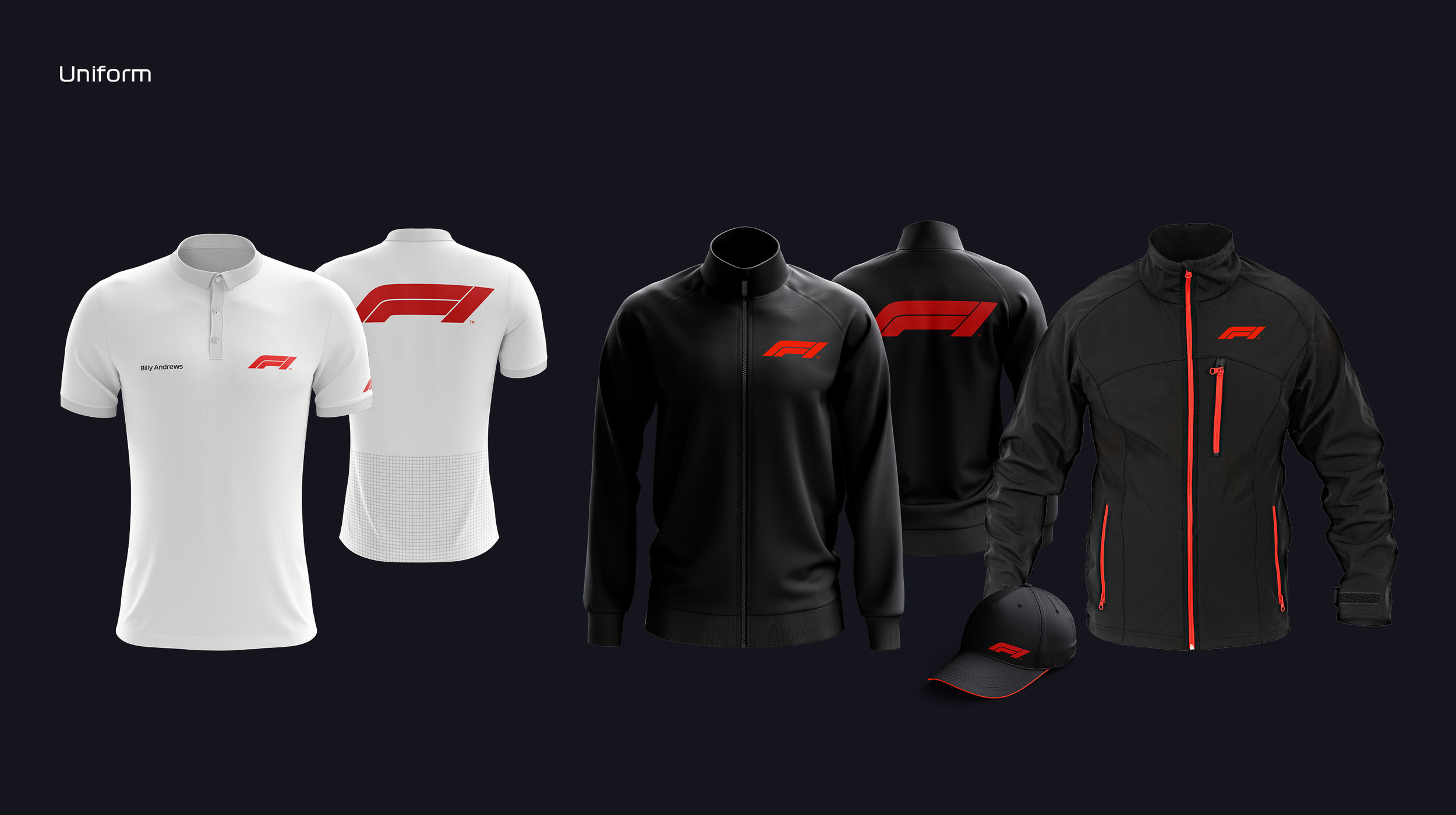
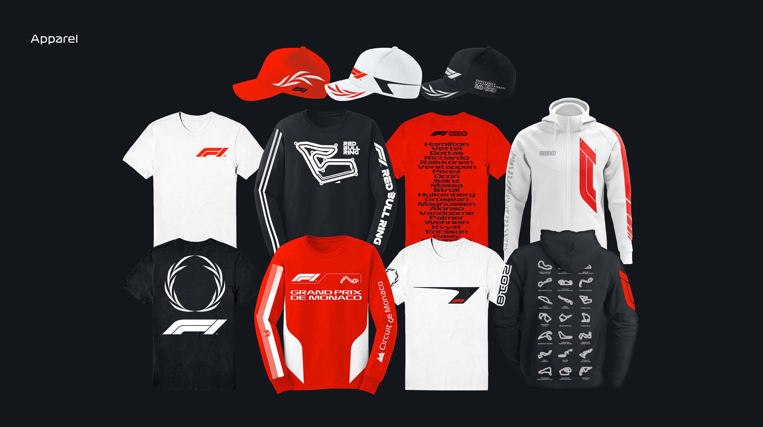
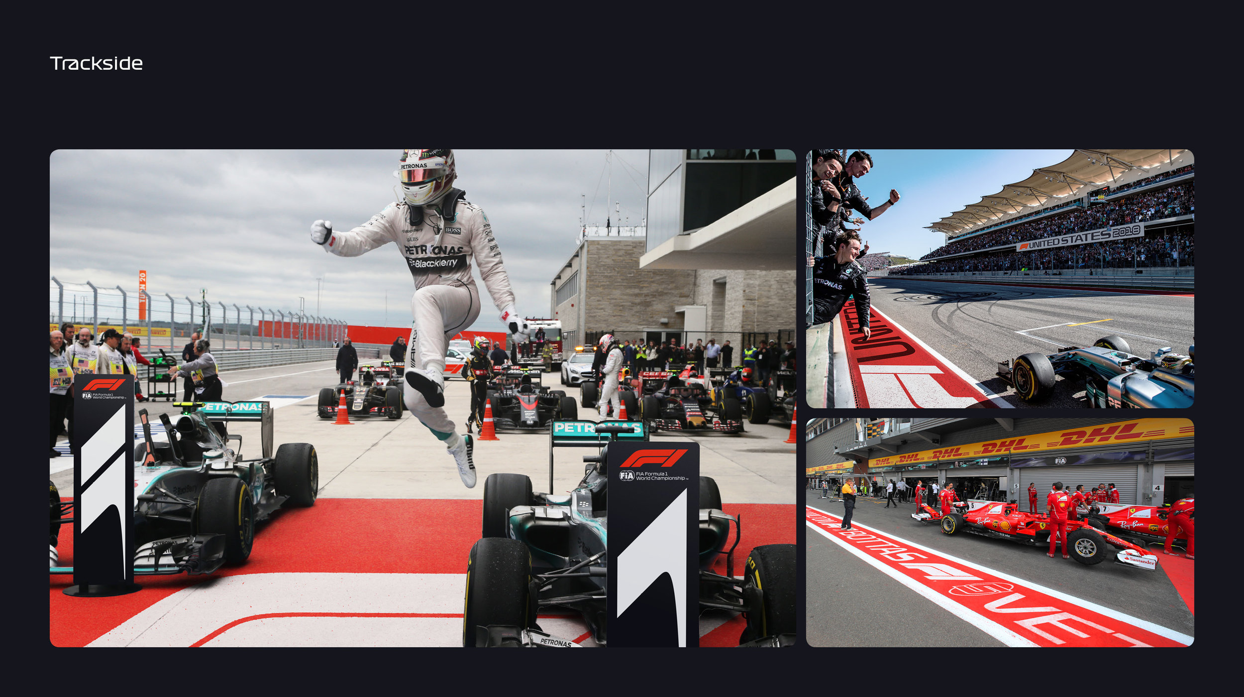
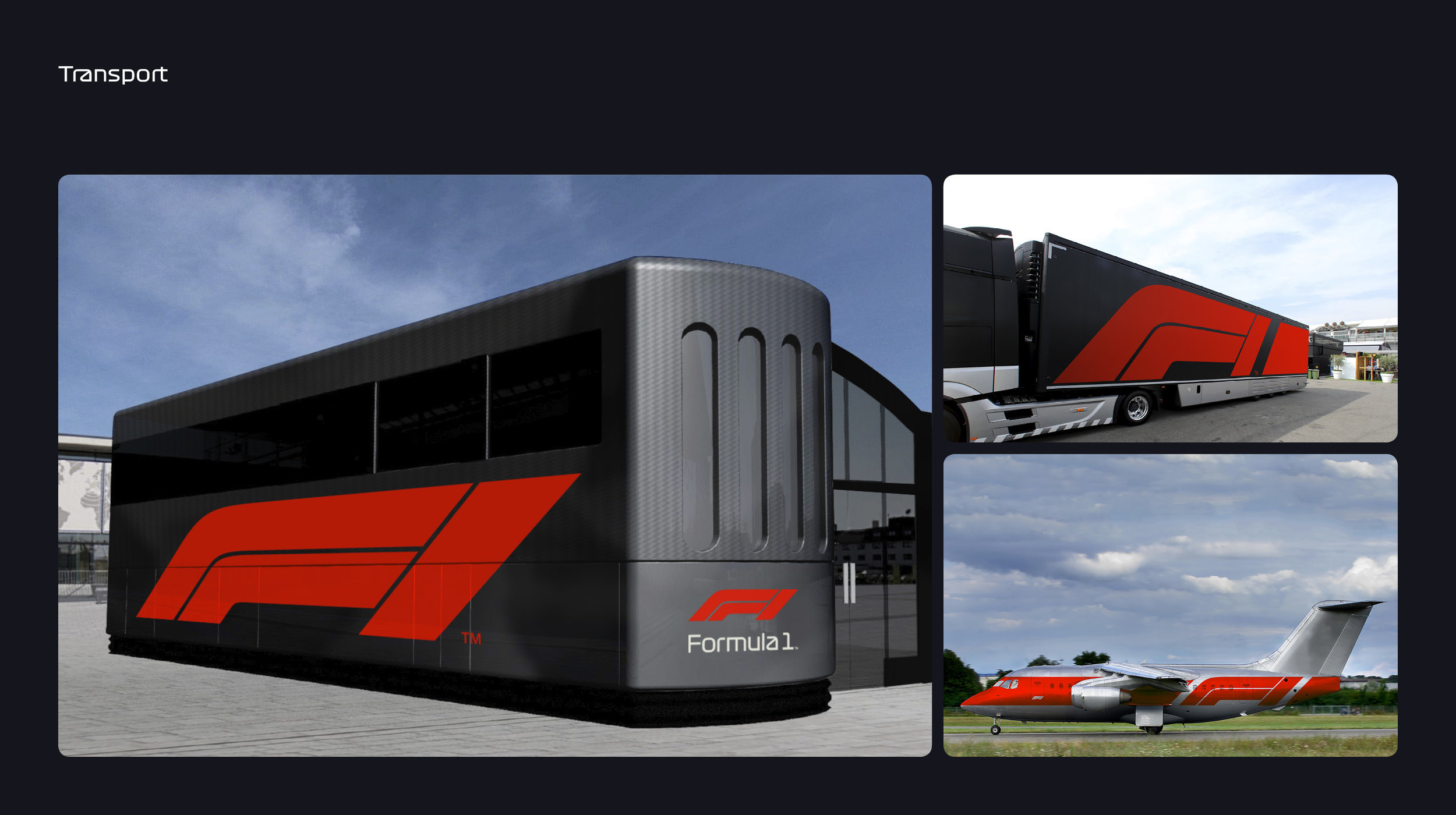
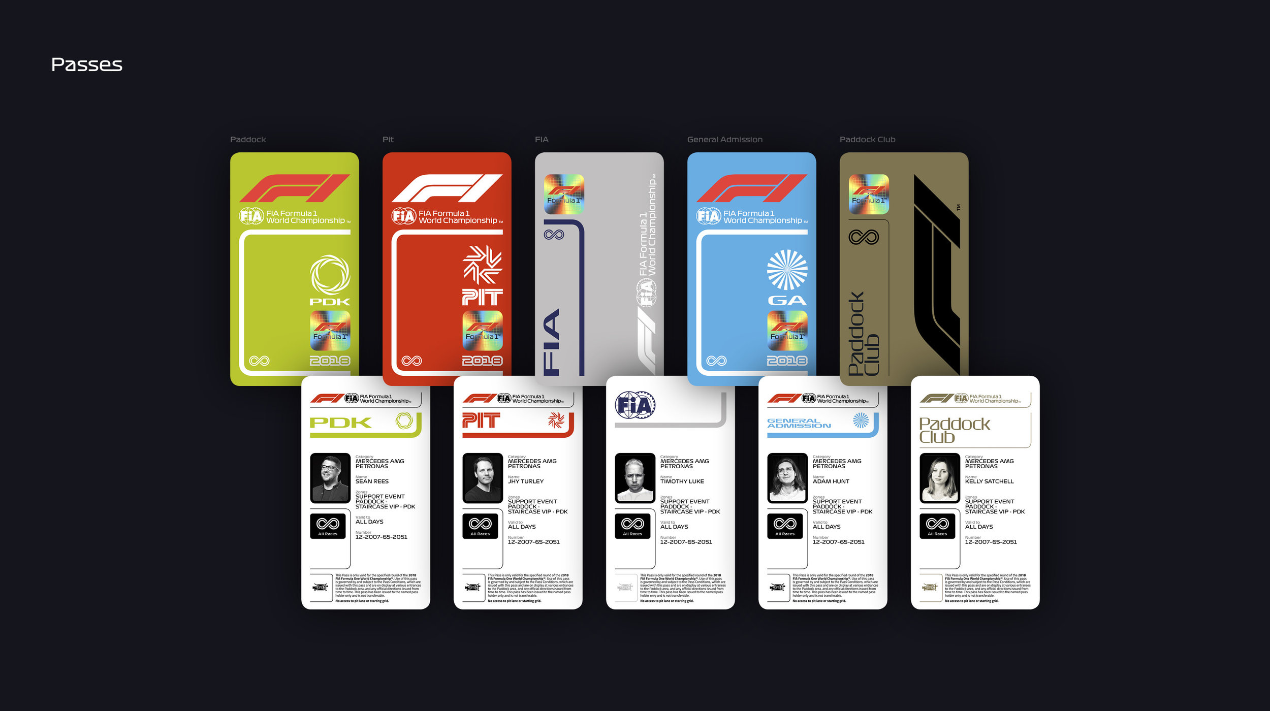
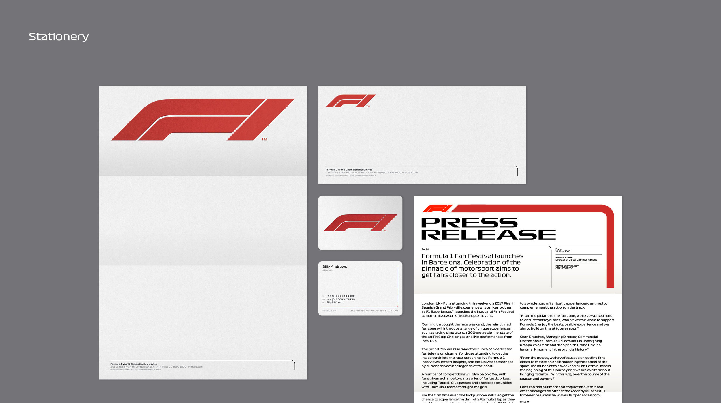
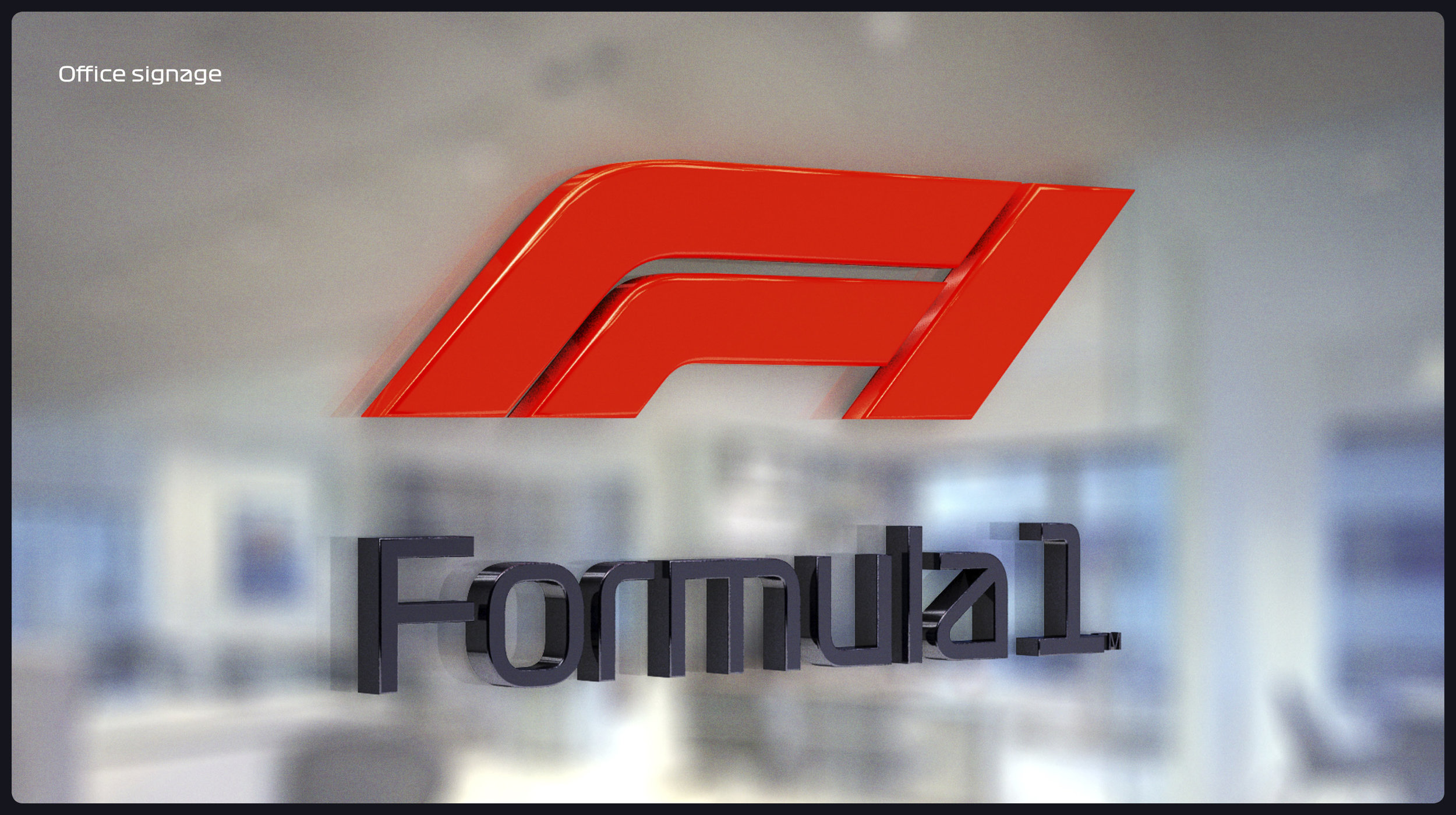
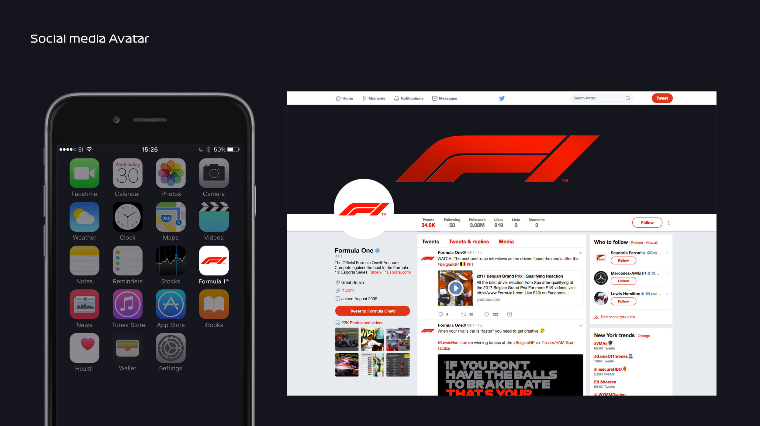
APPLICATION
Agency: Wieden & Kennedy
Client: Formula 1
Designers: Timothy Luke, Kelly Satchell, Sean Rees
Creative Director: Richard Turley
Artwork: Jhy Turley
Producer: Trisha